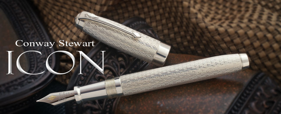
I do admit to having a bit of a love affair with sterling silver pens. So any time that I am reviewing a sterling pen I start with a slight bias. In the case of the Conway Stewart Icon, I went past the level of "slight bias" within a few minutes of holding the sample! I ended up at full blown love in no time at all.
There proved to be a number of reasons to fall in love with the Icon. Everything from the looks through to the size and weight. The fact that it is (almost) a solid sterling silver version of the Conway Stewart 100 was in itself reason enough for the rise in pulse rate when I first saw it.
We'll begin with the "less than perfect". It's nothing bad, just something that should be brought up from the start. The Icon is actually a bit smaller than the resin version of the 100. According to Conway Stewart there were several reasons for this. The main one came down to the fact that they really wanted to maintain their tradition of creating the pen of solid metal, rather than as an overlay. They have achieved a lot of success with their other precious metal pens, which with the exception of the Centenary Overlay, were all created using this design philosophy. While it makes for a heavier pen, there's no denying that it also makes for a very solid pen. How much difference is there in size? The resin version is 1/8 of an inch longer when closed, and the barrel is 1/32 of an inch wider across. Not a huge difference! In fact, the caps are the exact same width across on both versions.
Given the weight of the Icon as it is, I am not unhappy that they shrank the dimensions down from the resin 100 just a bit. As it stands, the Icon is an eminently usable design, while it has the heft you would expect from a solid sterling silver pen, it's not so heavy as to be uncomfortable to actually use. The Icon weighs in at just under 1 1/2 ounces, while the resin 100 is much lighter at only 3/4 of an ounce. The ounce and a half weight puts the Icon right in there with many other full size sterling silver pens. A quick browse through my sterling collection with the scale revealed that with a few exceptions on either end of the spectrum, an ounce and a half is ballpark for most of the large pens. (In case you wondered, the Aurora Optima came in on the light end at one ounce, and the Waterman Man 100 at the heavy end at well over two ounces!)
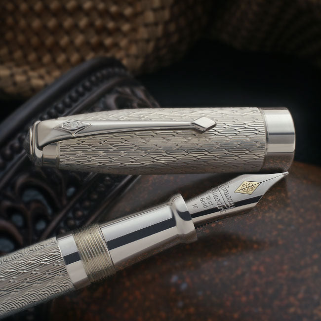
And owning this pen without using it (and using it a lot!) would be a shame! The large Conway Stewart nib used in the model 100 comes in a range of eight grades, everything from extra fine through double broad, and three italic sizes. Normally, for CS pens I prefer the broad italic, which puts down a very nice crisp wide line with a ton of width variation. It makes even my horrid handwriting look almost elegant. For this review, though, I decided to try something a bit different, and asked for the sample to be fitted with the fine italic.
Surprisingly (for me, anyway!) this turned out to be a real winner. The ink flow is robust enough to ensure that the line is wet, which I like regardless of what size the tip might be, but there was still enough of a flat cut across the nib tip to ensure that that you receive a definite "italic" line. The up and down strokes give you a nice crisp "fine-ish medium line with sharp edges, while the sideways strokes put down a very thin thread of ink.
The combination was almost as striking as the line from the medium italic, with the added advantage that, even with the wet line, this nib would easily be usable by someone with smaller handwriting. The line is thin enough that I was even able to use this nib on some of the pre-printed forms that normally require a fine or extra fine nib!
Filling is via cartridge converter, and especially with the fine italic nib, the ink capacity seems to be more than adequate. You might run through a converter load of ink rather quickly with the wider nib sizes, but then that just gives you the excuse to try new inks! In any case, the converter is of the standard twist fill type, and the same size as those used by pretty much all manufacturers, so no surprises there.
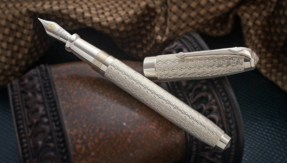
The Icon is made with a sterling silver section. The metal of the section is smooth, and normally I don't care for a smooth metal section, however the Icon does have what I consider to be the "right" shape, with the very front edge widening out enough to make for a secure grip. I found that my fingers fit securely and comfortably on the section, the fact that the metal was smooth to the touch didn't ever really enter the equation. The threads are placed far enough up to remain outside of the gripping area, at least for my hand.
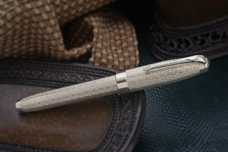
As I have mentioned, this is no lightweight pen... On the other hand, it's not overweight, either. In simple terms of weight, it's right in there with most full size sterling silver pens. It does have very good balance, even with the cap posted. There's enough taper to the design to keep the weight fairly low in the hand, and the solid sterling section helps in this regard as well. If you prefer not to post the cap, the balance is even better, but I found the overall length to be a bit short without posting.
Solid weight, good balance, and a nice choice of nibs all add up to a nice experience when it comes to writing. When it comes to looks, the Icon manages to outshine it's performance on paper. The cap and barrel offered a lot of area for embellishment, and Conway Stewart have taken advantage of that with a deep engraving pattern that covers both cap and barrel. Called "Foxhead", this pattern consists of interlocking triangles and lines that result in a pattern that is both subtle and elegant. It's not the sort of thing that "jumps out at you", but according to Conway Stewart, that wasn't the effect they were going for. They wanted to start with the simplest possible pattern, and work outwards from there, stopping when they hit a style that seemed the most "usable". Not too flashy, but still distinctive enough to set the pen apart.
In this alone they succeeded, the Icon is a very good looking pen! Yet still not so overdone that I would feel out of place using it just about anywhere. It's when you add in the overall size and shape and the design of the engraving that you get a great everyday user. I'm always impressed by pens that seem designed to be used rather than just displayed. It's easy enough to make a fancy limited edition, not so easy to make one that is also a very usable pen. The edition size is going to be 100 pieces, combined with a list price of $1250, this isn't likely to be an "impulse buy" for most of us. In this case, though, I think that it's safe to say that the Icon delivers your money's worth. The combination of limited production, a nice engraving pattern, and solid (very solid!) sterling silver construction all add up to a lot of pen for the money.
ARCHIVE
Conway Stewart Icon Edition, 2007


Archive Blog Posts
WES Journal edition #126, Winter 2023
Spotlight on Conway Stewart Originally published in WES Journal 126, pp 26-29, 2023

The History of Conway Stewart
The Beginning In 1905, Mr. Frank Jarvis and Mr. Tommy Garner formed Conway Stewart & Co. Limited at 13 Paternoster Row LondonEC1, next to St Paul’s Cathedral in London. Today,...

Conway Stewart 'Babbage'
Charles Babbage is popularly known as the “Father of Computing” for his pioneering work with computing machines. The use of Jacquard punch cards, chains and subassemblies, and the logical structure...

Conway Stewart Evergreen Sterling Silver Duro Special Edition
SOLD OUT! Retail List Price Fountain Pen or Roller Ball — £599 $970 €630 Welcome to our February 2010 Special Edition — the Conway Stewart Evergreen. Based on our popular Sterling Silver Duro model,...

The Balmoral
Following the success of our Windsor, which was inspired by the ornate decoration gracing the creations of English gunsmiths, Conway Stewart is pleased to announce the second in this prestigious...

Conway Stewart Cavendish Edition
Conway Stewart is proud to announce our new model in English hallmarked solid sterling silver, the Cavendish. A bold stylish design that brings together a traditional shape with a crisp...

Conway Stewart 'Elizabeth Garrett Anderson' Limited Edition
Elizabeth Garrett Anderson is regarded as England’s first female doctor; a pioneer in educating women in medicine; a strong supporter of women’s suffrage and opportunities in higher education, as well...

The Wellington Series
Arthur Wesley was born in Dublin in 1769. In 1798, his aristocratic Anglo-Irish family changed their name to Wellesley. In honour of Sir Arthur Wellesley, Conway Stewart commemorates the Duke...

Professional Series - Doctor's & Lawyer's Edition
The new Conway Stewart Professional Series is designed to reflect the dedication and life’s work of individual professional fields. These striking new designs are crafted of gleaming black resin and...

Kipling 'IF' Special Edition
The new Special Edition from Conway Stewart is inspired by one of the most important literary figures in English history. At first glance this pen looks like it has a...

Conway Stewart Belliver Series
The new Belliver model from Conway Stewart is a return to the finest traditions of CS heritage, rooted in attention to detail, a perfect size and weight, as well as...

Conway Stewart Montague and Capulet Series II
The 2013 Montague and Capulet series from Conway Stewart celebrates the principal characters of Shakespeare’s eternal classic Romeo and Juliet, bringing a graceful and elegant slim design to life in...

Excalibur Limited Edition
Conway Stewart is pleased to announce the latest new colour on the popular Churchill model — Excalibur with hallmarked solid sterling silver trim. The Churchill Excalibur hand made resin consists of a...

Conway Stewart Edwardian Limited Edition
Conway Stewart is proud to present our new limited edition sterling silver series, ‘The Edwardian’. Based on our popular Belgravia model, the Edwardian is completely crafted from solid sterling silver...

Conway Stewart Gatsby Limited Edition
“Nominee in the 2014 Pen World Reader’s Choice Awards — Best Cultural or Historical Theme” During the classic era of the 1920s, a fine fountain pen was considered not just a luxury,...

60th Anniversary 100 Series Special Edition - Pistachio
60th Anniversary Celebration! The 100 Series was first launched in 1954 and was quick to become one of the most popular Oversize pens ever made by Conway Stewart. In celebration...

Marlborough Vintage Limited Edition Pens
The Conway Stewart Marlborough Vintage Limited Edition is a distinguished new design, that is inspired by the classic styling of our vintage models and created with our present day manufacturing...

Jaguar Limited Edition
The Conway Stewart Jaguar is a new finish to compliment our sold out Elegance Aztec limited edition. Each pen from the Elegance range has a unique design and is produced...

Conway Stewart Collectors Club - Celebration Pen & Book Special
Offered only to members of our Collectors Club, Conway Stewart is making available the Celebration pens accompanied by a hardback copy of the new book, Fountain Pens for the Million — The...

Conway Stewart Collectors Club - Churchill Carbon Fibre
Conway Stewart is making available exclusively to members of the Collectors Club our award-winning Churchill model with hand wrapped Carbon Fibre overlay covering the cap and barrel. Each pen is...
Leave a comment